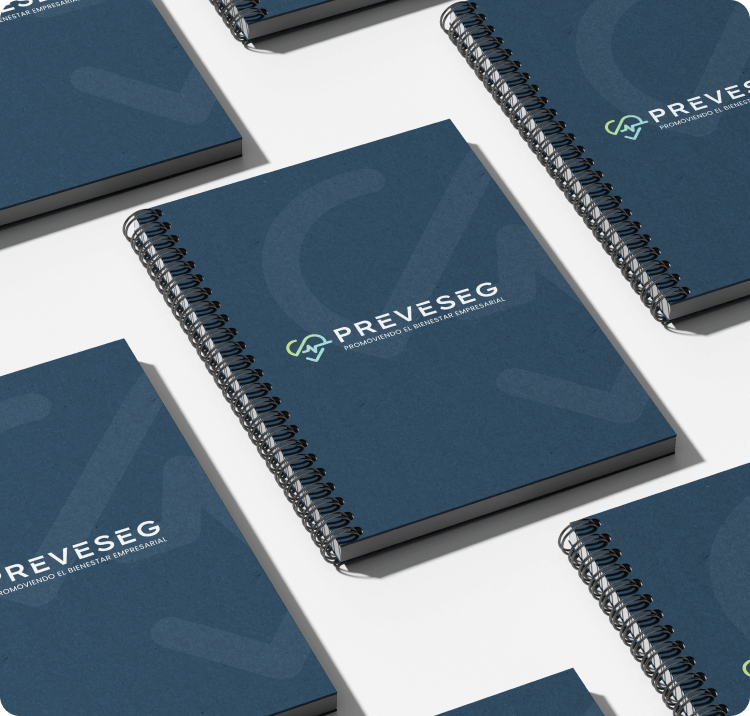
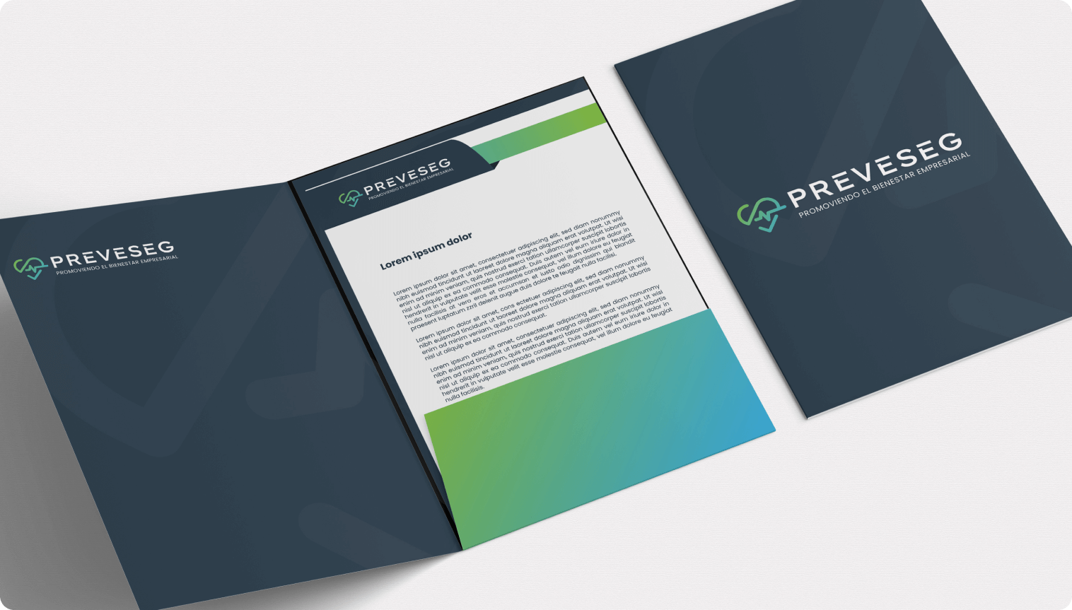
The PREVESEG brand was designed to communicate trust, care, and professionalism core qualities of a company dedicated to promoting corporate well-being. The logo integrates a heart and checkmark, symbolizing health and compliance, while the clean typography and structured layout reflect clarity and confidence. The color palette greens and blues evokes calm, balance, and reliability, reinforcing PREVESEG’s role as a multidisciplinary ally in workplace wellness and legal safety.
This identity supports the brand’s mission to offer integrated solutions in occupational health, mental well-being, and labor law. It visually positions Preveseg as a modern, human-centered organization capable of guiding companies toward safer, healthier, and more sustainable work environments.